Case Study: Hotel More’s New Website Design
Guest author: Jelena Gvozdanović, PAPIR I OLOVKA
Hotel More is one of those truly special places. An elegant hideaway nestled among pine trees and rolling waves, offering guests peace, comfort and a sense of being genuinely cared for at every turn. It’s the perfect blend of refinement, warmth and natural beauty – a little slice of paradise.
For many visitors, their very first encounter with the hotel happens online. That made it essential for the website to capture that same atmosphere and charm. Our challenge was to create a digital experience that feels just as smooth, calming and inviting as a stay at the hotel itself.
Where It All Began
Our aim was to design a website that feels contemporary, clear and easy to navigate, yet still faithful to the spirit of the hotel. A site that conveys digitally what guests experience in person: views of the sea, elegant interiors and meticulous attention to detail.
We wanted visitors to sense the hotel’s quiet luxury and serenity from the very first click.
Design Elements
We started with Hotel More’s refreshed visual identity. Using the brand guidelines and the creative brief as our foundation, we defined a visual style that mirrors the hotel’s atmosphere – the elegance, tranquillity and understated luxury that greet every guest the moment they step into Lapad Bay.
One of the most memorable aspects of this location is its sunsets. From Hotel More, the view of the sun dipping into the sea is completely uninterrupted. The golden hues dancing across the surface of Lapad Bay are so iconic that they were incorporated into the hotel’s visual identity. For the website, we chose the logo’s golden shade as the primary background colour. Paired with the hotel’s deep navy brand colour, it created a warm, calming browsing experience.
We carefully wove that golden tone throughout the design, even applying it to the hotel photography to achieve a sense of cohesion and harmony.
Two complementary brand typefaces – a striking, modern typeface for headings and a more classic one for body text and links – helped us create the right balance between contemporary design and timeless elegance.
A Guided Digital Journey
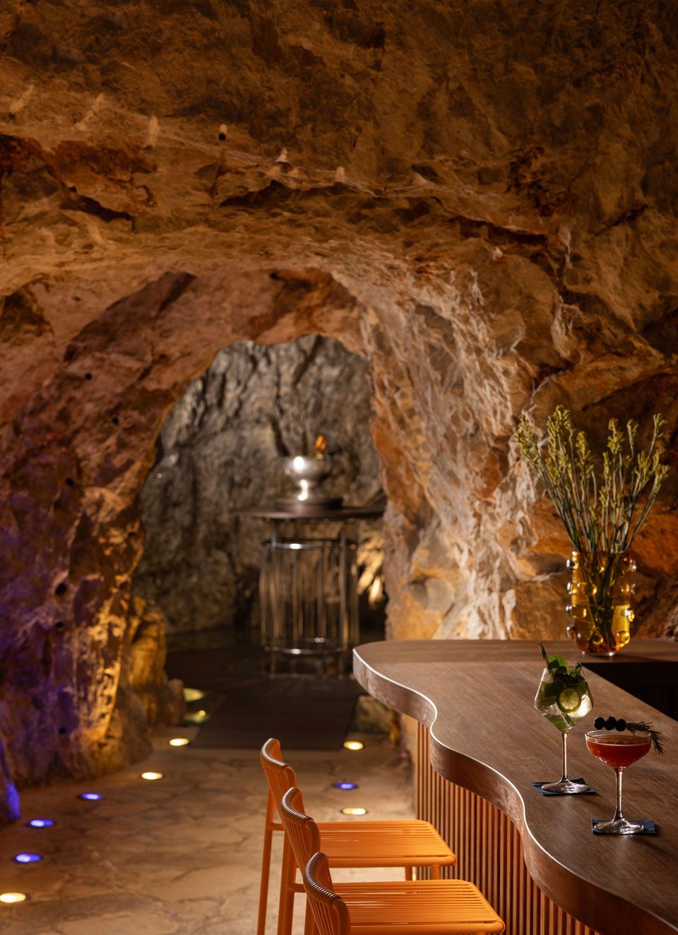
Beyond accommodation, Hotel More offers a wide array of experiences, from restaurants and a wellness centre to its unique cave bar. The new website needed to present everything clearly without overwhelming visitors. Our focus was simplicity: making sure guests can easily find what they’re looking for, whether they’re browsing on a phone, tablet or computer.
Equally important was ensuring intuitive navigation and a fast, seamless booking process. Today’s users expect information instantly and want to book their stay without any hurdles. For that reason, every section of the website was thoughtfully structured, guiding visitors naturally through the hotel’s story, with the path to booking made as straightforward as possible.
A Collaborative Effort
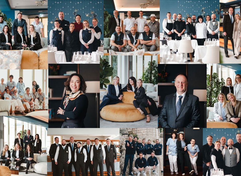
From start to finish, the process was open, collaborative and wonderfully creative. Together with the Hotel More team, we exchanged ideas and shaped the content based on their insights into what guests most often look for. This collaboration once again highlighted how valuable it is to combine design expertise with the client’s real-world knowledge and the needs of their guests.
The final result is a website that extends the hotel’s philosophy into the digital space: a place where beauty, comfort and attention to detail make every encounter special. Its new look is far more than a visual update — it’s a digital experience that reflects the hotel’s unique atmosphere, inspires visitors and guides them effortlessly through every part of their stay.


